Two weeks after the launch of the 2025/26 Primary shirt (which I rather like despite it being solid amber rather than stripes and featuring tiger stripes which I think we’re using too much and running the risk of being gimmicky and pastiche – Review here), Kappa and the Tigers have pulled the curtain back on the away shirt for the upcoming season, and my response can be summarised with… “OOOOOOOOOOOOFFF!”
Let me immediately say that if there was a Pepsi Challenge to take between the home and the away, I’m going with the away shirt as my preference. Barry Wilson, the concept kit designer and diabolical genius behind last seasons beautiful all-white change kit, has been given a crack at the predominantly black follow up and you have to say he’s captured lightning in a bottle again.
Replicating what worked with the ‘Jackson Pollock paint splash tigerprint’ shirt last season, this years away has a wonderful polo-collar and repeating Kappa Omini’s across the shoulders.

The most notable feature of the shirt though is the thin amber stripes throughout…they’re too thick to be termed pinstripes, so I’ll go with chalkstripes. My first inkling on seeing the shirt was “maybe pinstripes would have worked better”, but at that point my brain did some autonomous thinking and concluded “No! If the intended shorts are amber, then you need enough amber on the shirt for it to be congruent with amber shorts!”
One of my favourite colour blocking ensembles came in 2012 when City matched black shirts and socks with amber alternative shorts for the League Cup tie at Donny Rovers. The Tigers stunk the place out from a purely footballing perspective, but sartorially they looked sharp.
That’s the only time we’ve gone black-amber-black to date, but there is a possibility with this kit that we could see that combo again, as the full away kit has amber shorts, even if that is really done so they can be used with the home shirt away from home when the opponents have dark primary shorts, and we might see this shirt worn most with the black ‘home’ shorts.
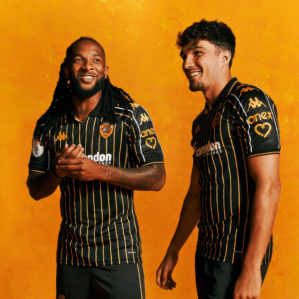
The chalkstripes match the width of the amber trim on the collar and cuffs. The amber chalkstripes are repeated on the back of the shirt (so white names and numbers I reckon) and extend to the sleeves, though they are bifurcated by the three Ominis on each sleeve which are contained within white lines. This subtly gives balance to the overall shirt given the white sponsor appliqué and presumed white name and numbers.
Yep, I’m sold on this, I think this is going to be the stand-out kit of the 2025/26 set, and it is a fine addition to the black shirt pantheon which now stands at nine, ten if you include the late 1994 limited edition shirt that Deano wore on the West Stand of Boothferry Park while dressed as a Chavvy Santa. No, no, we can’t count that, because then you’d have to count the long sleeved black Kappa leisurewear shirt from last year too and then it’s all getting out of hand.
Could it be made better? Sure, I’d love to see a full placket with buttons, but then those are lacking on nearly all the Kappa shirts with polo-collars this year, so that’s on the supplier not those involved in the early stage design process.
Regardless… this is OOF SIZE LARGE!