

The 2025/26 Primary shirt by Kappa was revealed just hours before it’s on-pitch debut against İstanbulspor at the Turkish Football Federation’s training base on Tuesday.
After three consecutive seasons in traditional stripes, the latest entry into City’s shirt pantheon is a fascinating mix of two other recurring styles; solid amber, and tiger stripe ’92 throwback.
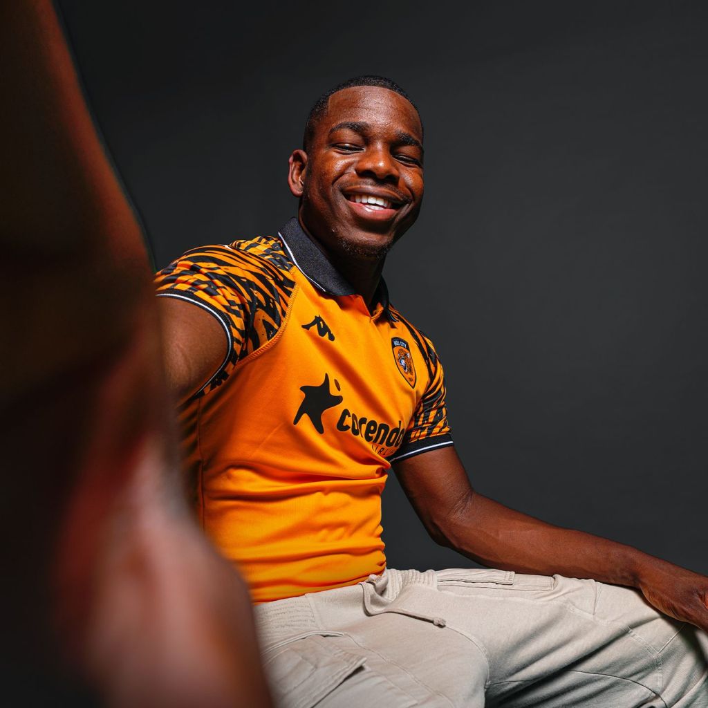
Naturally, the most striking element is the sublimated tiger print, which is confined to the Raglan sleeves, but other details are worthy of note.
Two of the four shirts from the 2024/25 kit-set had polo collars, but the primary shirt wasn’t one of them. This time round the ‘home’ shirt has a collar, the first since the 2002-04 primary shirt by Patrick, which had a polo collar over a wrapover V-neck.
‘Proper collars’ fell out of favour in the mid-2000s, when performance became the watchword in kit design. Aesthetics took a back seat in the race to make shirts ever lighter, thinner and more see-through. In this era, polo-collars were deemed to be nothing more than pointless ballast. Having gone so long without collars on shirts, I have to say that I’m revelling in this polo collar renaissance.
This polo collar follows the style of those used on last year’s shirts, there’s no placket or structured neck panel, just a simple notched neckline under the ribbed collar, which is black with a discreet, thin white stripe. This visually connects to white ominis, one on each sleeve, the ribbed cuff which has a white stripe sandwiched between two black bands, and the Anex sleeve sponsor which is a white heat bonded applique.

The body panel is plain amber, there’s no embellishment like there was on last year’s four shirts in the form of a debossed herringbone pattern, which enriched an otherwise simple design. That’s a good choice when you have a lairy sleeve print, I feel.
Frankly, I’m a bit conflicted about the use of tiger stripes again. It works really, really well here, confined to a print on the Raglan sleeves so that it doesn’t overpower the shirt, and if you removed the sleeve print the shirt would likely look a bit ‘Meh’, but on the other hand I do feel we’re leaning too much into tiger stripes.
They were on last season’s third shirt in tonal form, hinted at as a Jackson Pollock-esque pattern on the sleeves of the away, appeared as an embossed pattern on the training top, and the Matchwinner 1992/93 shirt was reissued.
Before that they were a tonal print on the amber stripes of the 2022/23 home, Umbro’s 2019/20 Primary was a modern take on the Matchwinner classic, and the third shirts in 2017/18 and 2018/19 had tiger stripe elements.
I can’t think of another team who visually refer to their nickname as much. I fear that it’s becoming a bit pastiche, and I’d like us to steer clear next season, BUT… this does look really good. I understand the commercial pull to having a largely solid amber shirt after three striped shirts in a row, and the sleeve print is undoubtedly well executed.

The black shorts with two amber piping stripes on each side look like throwbacks to those that were part of Patrick’s 2003/04 change. Retro shorts! What a time to be alive.
I can understand why some people might think the lack of tiger print on the shorts is a missed opportunity to visually connect them to the shirt, but I suspect we’ll have some amber shorts on one of the other two kits with interchangeability in mind, and unless there are tiger stripes on one of those other kits, it simply wouldn’t work.
The socks used against Istanbulspor were last season’s third kit shorts pressed into extra time, Turkish Kappa are having some hosiery production issues, we should see the real home socks at some point.
Overall, this is a decent effort, and that belies a somewhat chaotic design process. Some people have said this is merely a recycled 2024/25 third shirt, but I violently disagree, I think this is a better garment by far, and that polo-collar is sweeeeeeeeeeet!
