
We’re anticipating the last of this year’s Kappa top drops later this week, following the logic that Tiger Leisure have launched new tops just after the August, September and October paydays this year, and we’re fast approaching peak gift buying period.
Where a new drop might rank in league table of Kappa top drops we’ll argue about soon enough, but ahead of that release let’s nail down where each of the six releases, from the OG jacket unleashed upon an unsuspecting yet garment thirsty Tiger Nation one full orbit of the Sun ago, to the function specific ‘Walkout’ jacket first seen when the Tigers, err, walked out onto the pitch ahead of the Sunderland home game, sits in a polyester pantheon.
This doesn’t just reflect our views either, as we’ve thrown this out to the public, and as several high profile elections have shown in recent years, surprising things can happen when you give the man on the street a ballot paper. We’ve tallied the votes, here’s the results, from last to first, with some choice words from constituents and maybe an observation or two of our own…
6th… August ’24 ‘Kempton’ quarter zip top
“I’m not a fan of quarter zips, or half and half tops. If there was 20 [to choose from], there’s a good chance I’d vote this as 20th.”
“I’m wearing the Kempton top right now and I’m a fan of the style, but trackie tops really are my thing, so no shame in it being fifth [in my own rankings.]”
“Kempton without amber yes, but with looks like it ran out of material for the arms.”
“Kempton one is awful, the rest are all very smart”
“Kempton top – unmistakable club colours without being too garish”
“The grey/black/white on the Kempton is giving me FC vibes”
The most visually appealing thing about the 0-0 draw with Millwall in August was head coach Tim Walter doing his usual theatrical prancing in the technical area in a never before seen garment. Indeed, Der Boss had soft launched what we’d learn is the ‘Kempton’ top, a quarter-zip sweatshirt with a black upper body contrasted by a smoky dark grey lower panel. Mostly grey sleeves were embellished by amber-piping edged white bands containing repeating black ‘Omini’ logos and a chunky amber band at elbow level.
City and Tiger Leisure had listened to feedback regarding the 2023 releases and this garment had the Kappa ‘Omini’ fully embroidered and the club crest is a sewn-on woven patch. The quarter-zip top is a very different animal to its forebearers, and the use of grey in the colourway added to the vibe of distinctness.
The sizing of this garment though, is quite off, XL was all good for the 2023 releases but that same size here was tight, in fact the arms were so constricting I worried about my blood circulation being hampered. The straight panel across the stomach added to my ‘dad bod’ self-consciousness. A shame, because I quite like how it looks on Tim, who clearly has sized up a few times. Not popular with our voters though, tough crowd.
5th… December ’23 Amber jacket

“Amber jacket: At first I loved this, it’s just not overly practical to wear. However, it’s perfect for trips out of Hull though to shout about the Tigers.”
“The amber jacket was a excellent second issue, using a great design in a different colour[way].”
“I least like the amber jacket because there’s just too much amber. Saying that I don’t dislike any of them overall.”
“As for the amber…. no one needs to look like a satsuma.“
“Dec 23 Jacket – “awesome, another version in case you couldn’t get the first one. The Amber is a bit full on though. I can’t pull that off.”
Initially I felt almost personally attacked by the disdain shown by some for this jacket, which is my personal favourite. For me, the boldness of our principal colour is a strength, the brash impertinence of so much brightness is a plus for me, but I’ve learnt some people feel it needs a certain type of person to ‘pull it off’. Do people feel that way about mostly amber shirts then? If not, what’s the difference?
Anyway, I’m used to having slightly louder tastes in outerwear than your average cat, so I’ll be all Stoic about this finishing fifth. The bold HULL CITY on the back of the 2023 releases is one of my favourite elements, though I wish it had been applied in a more premium way given the premium price, I’m always worried this will come off in the wash at some point. For pure aesthetics though, this is the one for me, get it up ye.
4th… December ’23 hoodie
“This is my go to piece of merchandise to wear. It’s good looking and comfortable to wear. The only downside is the fact the hoody covers the ‘HULL CITY’ vinyl branding on the back. A slight oversight, maybe?”
“Not a fan of hoodies, really like the simplified tiger head badge on the recent releases.”
“I’m more of a fan of hoodies than trackie tops, hence the hoodie being my first choice. If they did them all in a hoody I would have been happier.”
“The hoodie I can get on board with as an all rounder alternative to a retro looking jacket and is the most applicable when it comes to wearing as a daily.”
Having a hoodie of the OG black jacket makes total sense, it was a good addition to the pantheon, but since I loved the Hull City text on the reverse, having a hood covering it felt a bit wrong, I agree with the first commenter on that. I have one, like. I have a problem.
Debt.
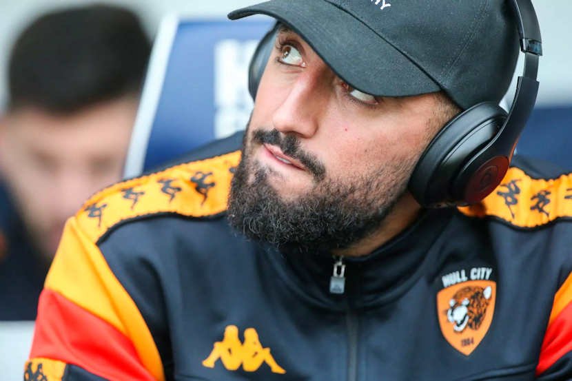
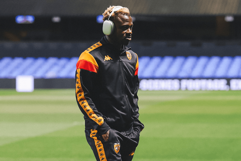
3rd… October ’24 Walkout jacket
“Walkout jacket is a stunning design.”
“The Anniversary badge is unreal, that’s why the newer Walkout is second for me. UNREAL.”
“The Anniversary and Walkout jackets are really smart, again simple is best.”
“Back to the decent colour scheme. but starting to get the feeling the club just want to milk us for our cash now. Don’t like the cut off halfway down the arm – looks and feels odd.”
“The new Walkout jacket is streets ahead of any other, in my opinion.”
“Walkout probably my favourite, taking me back to being a kid at BP. Just reminds me of Radders.”
I was a bit “ho hum” about the Walkout jacket at first, but it’s a real grower, and after the sleek subtlety of the anniversary jacket, getting some amber on that same style of jacket was a fine move. Images from the Sunderland game didn’t do this jacket justice, it’s far, far better looking in the flesh, err, polyester, than it is photographed. Quite enjoyed the cheeky use of retro Don Robbo red after it was absent in the first two releases of 2024.
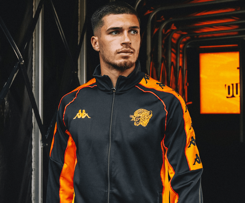
2nd… the OG, the November ’23 black jacket
“Just the overall look of the original Nov ’23 black jacket wins it for me. It just beats the amber jacket purely on the basis it goes with more things when wearing casually. The Kappa logo travelling the full length of the arms gives them the full retro look.”
“The black ‘original’ one is just really smart, simple and a nice nod to some of our older shirts.”
“I’ve opted to vote for the OG release as my top pick. Not only is it beautiful, but it started the trend of City fashion lines.”
“Nov ’23, the original and the best (IMO). The introduction of the full sleeve Kappa ‘Omini’. Also, the first time (in memory) we’d reintroduced red as a palette colour, that added to the nostalgic and retro appeal. Furthermore, Jean Michael Seri, quite simply, wore it best.”
“The original and best” is a slogan that appeared on cans of Irn-Bru and boxes of Corn Flakes, but it sure fits being attributed to the first of the Kappa top drops. We’re probably a bit blasé at this point, six releases down and another to come, but I’ll wager we’ll look back on this era of leisurewear releases with real fondness when it has passed. I just can’t see any other supplier agreeing to indulge us like this with designs from the back catalogue of a sportswear giant and some stuff done for LOLs.
A year is a long time in nostalgia, but in 2023 we were all on board with the ‘one family, one dream’ ethos, being a City fan felt good again after years of being treated with contempt and disdain by grudgeful owners. With these jackets (and bottoms if you wanted to go full Top Deck Prinny Quay) we had a uniform that married our colours and identity with a funky brand who’d outfitted classic Barca, Juve and Monaco sides as well as Olympic champions. **SIGH**
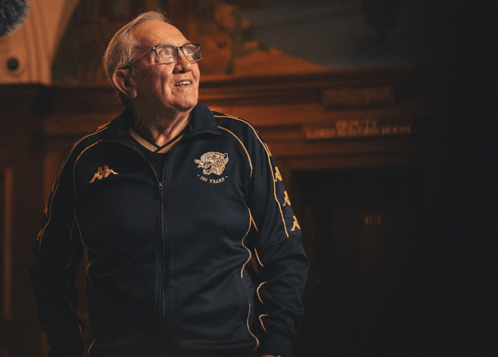
1st… September ’24 120th Anniversary jacket
“The Anniversary jacket is simply class.”
“I love all of the tracksuit tops, but the colours and the ‘120 Years’ logo on the anniversary jacket make it extra special.”
“Would like the anniversary gear more if it had the club name on.”
“Simple, but stands out, and also Waggy wearing it!”
“Love the old fashioned tiger-head in gold!”
“All about equal in their outstanding design, except the anniversary crest wazzes on the standard badge!”
“The Anniversary edition is beautiful, and I’m grateful the club made a release in recognition of the milestone. I can’t decide if having the Kappa logo all the way down the arms would improve or hinder the look as it’s the most plain looking of the set, and so subtlety is a good thing?”
Never in a billion years did I expect to see the sight of Waggy rocking a trackie top with the Kappa ‘Omini’ across the shoulders. No matter how disappointing the advent of ‘Walterball’ has been, this will be the enduring memory of the 120th Anniversary for me. Freeing the tiger-head, even the chinless 2019 iteration, from the plectrum shaped shield and rendering it in gold thread looks magnificent.
Using gold willy-nilly is tacky personified, just think of fat arsed Bransholme lasses on the school run wearing velour pants and ‘Juicy’ on the arse in gold studs to know it can go very wrong, but using black and gold for the anniversary? Yeah I’m ok with that, especially when it looks this good.
Perhaps my only disappointment is the lack of the club name anywhere, just think how good ‘HULL CITY’ in gold embroidery would look on the back of this? Still, I’m in violent agreement with the voting masses, this is the pièce de résistance of the entire range.
Providing the next one doesn’t top it!
Right, I’m off to drink espresso from a tiny cup wearing the Anniversary jacket, pretending I’m a background character in ‘The Sopranos’. Thanks to all who voted. Here’s some final quotes from those who sent in their views about the Kappa top range overall…
“Very hard to choose!”
“All are absolutely fantastic, great designs that look good. It’s fantastic that we have had so many to look forward to.
Never know about the sizing though, and there should be enough produced for all fans that want one, not a limited free for all.”
“Love the HULL CITY on the reverse of the ‘23 garments, would like the Anniversary gear more if it had the club name on.”
“Quality over quantity for me, apart from the Anniversary one, I think three releases in three months of the new season is over the top.”
“Just classic styles that fit with our club identity and not the same as any other kappa kit club”
“When they’re good, they’re very good, when they’re not, they’re a bit… meh!”
“I guess I’m going to be the only respondent who doesn’t actually like them. I think they are awful. Plus, I loath the red in the team colours, reminds me of Grandways and the City kits of the mid 80/90’s, again, not a fan.”
“Love the original retro stuff with the 80’s feel, and the 120 stuff is superb.”
“We haven’t needed four separate jackets in the space of a year. However, they are all good, even those lower ranked. Not a dud among them. Also, even though it isn’t Kappa, shoutout to the Matchwinner retro jacket we saw brought back this year too… which might be my favourite of the lot.”
“The first jacket was pure retro perfection and set the standard beautifully.”

