

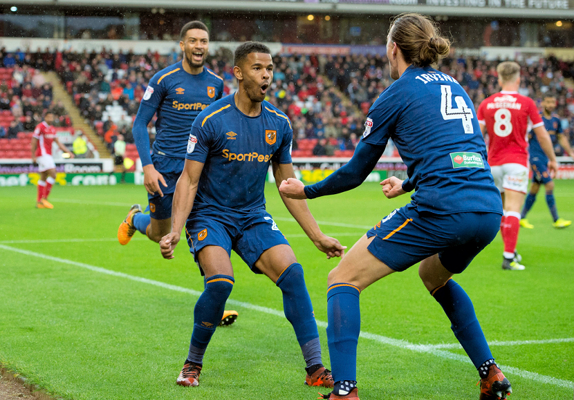
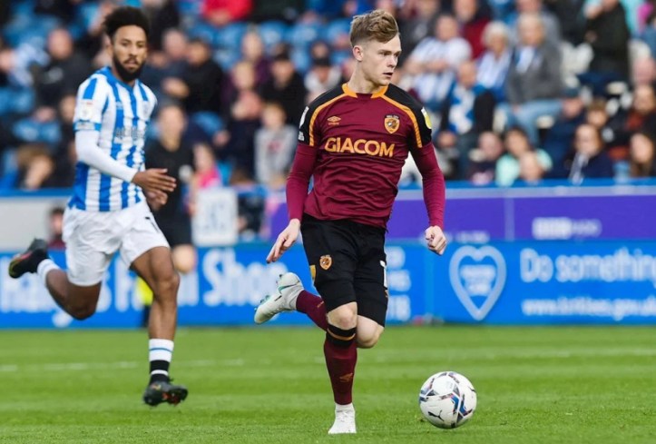
With primary kit and change kit order decided, it’s time to rank the eight distinct third kits that Umbro supplied the Tigers with since 2014 (we’re not counting the 2022/23 third as it was the previous season’s change kit, so was covered in the feature on aways).
For the most part, you know what you’re getting with primary and change kits, some order of amber and black for the former, and mostly white or black for the latter. With third kits though, that thinking goes out of the window, there’s no such thing as a traditional third kit and since the whole point is to be nothing like either of the other two kits, designers are freed from the shackles of established club palettes and go a bit wacky.
And go wacky Umbro have with thirds on occasion, though it must be noted that they’ve done so with uncommon colours rather than with striking prints, which have been a wider trend in kit design in recent years as the nostalgia focus ticked over to the early-to-mid 1990s, when challenging all-over prints were the avant-garde.
NB. Though we understand that kits become ineluctably linked to the games and season(s) they are worn in, we’re attempting to judge Umbro’s 2014-2023 output for Hull City solely on aesthetics and technologies with these rankings. Relegation does not render beautiful polyester unpalatable, and promotion does not transform bang average kits into masterpieces. We canvassed the opinions of Tiger Nationals on Twitter ahead of writing this article (and the response was phenomenal), using a Google Doc to collate votes. Though we asked people to just consider the visual and sartorial appeal of kit and not be swayed by events that occurred when they were worn, it is inevitable that some of that will seep in. Because this is our own corner of the internet, we’ll order kits by our own ranking first in descending order, but state how they fared in the aggregate view of Tiger Nationals who voted.
If you took part in any of our kit polls for this, you have my kit-loving gratitude. – Les
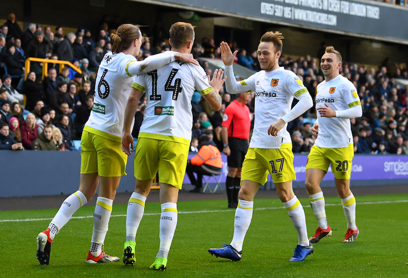
8. 2018/19 – Fascinating fact – early design iterations of this kit had it rendered in just white and the grey used on the subtle tiger stripe band on the chest. The fluoro yellow, ‘Sulphur Spring’ in the Pantone guide, was evidently added later, and given what we’ve just said about white shorted sides and City again having two distinct sets of black shorts in 2018/19, something light that isn’t white makes the third kit mightily functional, not just as some people say ‘a cash grab’*
It’s remarkable that it took the Tigers 114 years to have a kit with some fluoro element given everyone was at it in the late 80s and 90s, even Scarborough got in on the act with that luminous bile coloured shirt they wore when far more people where in Boothferry Park than was publicised in 1999. The feint, faux-hand-drawn tiger stripes meant that two third shirts in a row featured a tiger pattern print, as if testing the waters for a full on tiger print home shirt which we got a year later. This kit was alright, but surprisingly unmemorable for a kit with fluorescent elements.
*Which is bollocks anyway, as third kits are made in such small quantities they don’t generate much money for the club. eBay sellers moving on third kits probably get a bigger markup a few years later.
Aggregate fan ranking – 5th – The voters like this kit significantly more than me.

7. 2020/21 – When considering away kits in part two of this three part series, we noted that the 2016/17 change shirt is quite smart in isolation, but when paired with the shorts and socks, it all falls down as an ensemble. The 2020/21 third is the flip side of the coin, in that the shirt on it’s own, a white body capped by an ‘Ibiza Blue’ yoke, is a bit basic, but when you add the shorts and socks you have a really smart and hugely functional kit.
Calling a kit functional might seem like I’m damning it via faint praise, but functionality was important for this season, when both the home and away had black shorts, and not having white shorts was a good idea as 37.5% of League One teams had them as part of their primary look. I quite like this kit, yet I’m placing it second last, which gives some indication to the strength of Umbro offerings over the last nine years, methinks.
Aggregate fan ranking – 6th – The masses like this kit a wee bit more than us.
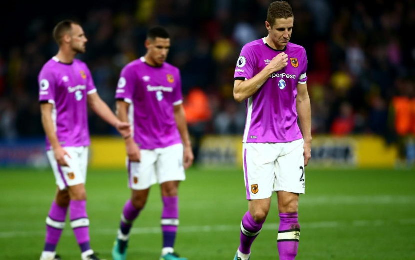
6. 2016/17 – If it’s possible to have pity on a football kit, then this is the one that deserves it. Worn twice in defeats before it ever went on sale, one of those defeats a dry-bumming at Bournemouth, in a season pock-marked with rancour as the owners created a situation in which we were pitifully prepared for life back in the Premier League, making a quick exit via the relegation trapdoor inevitable, this kit was doomed from the outset. That’s before you consider the challenging colour of Cactus Purple which had some people unwittingly outing their sexual orientation insecurities via rants about pink garb. Doomed.
But you know what? It was the most interesting kit of the set in 2016/17, and did what third kits should do by being something totally removed from the norm. They should have gone the whole hog and rendered the crest in white and purple, as an amber crest stood out like a sore cock against a Cactus Purple backdrop. I applaud Umbro for giving us this, and City for going with it, but given the miasma of misery that surrounded the club in 2016 it draws ire even in retrospect, but I can’t help but have some affection for it.
Aggregate fan ranking – 8th – Tiger Nationals rate this kit quite a bit less than me.
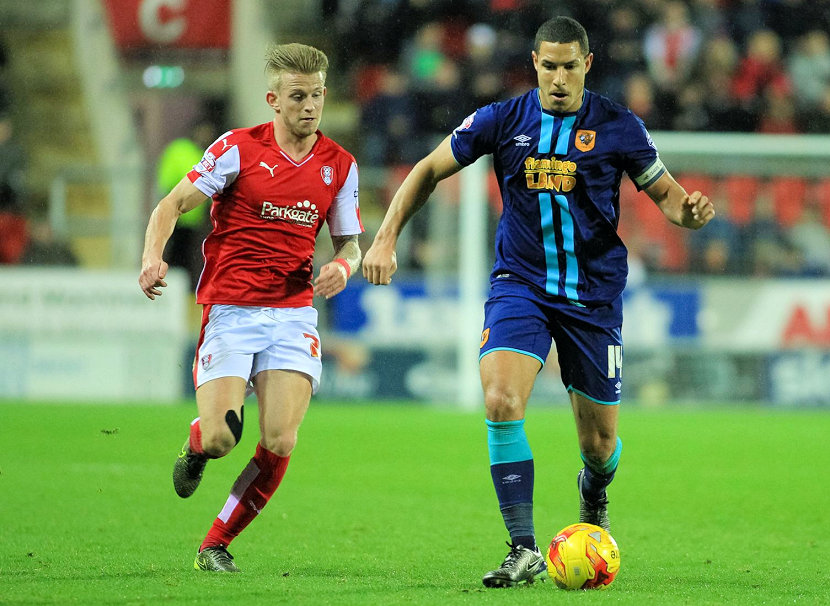
5. 2015/16 – Only seen twice and sold out by Christmas, this third had perhaps the most amusing colourway name as Umbro favoured tones taken from Pantone colour of the year nominations: Blueprint and Scuba Blue. Haha! I might have railed against the ridiculous name back in 2015 but I’ve mellowed a bit since then and come to enjoy the silliness of Pantone nomenclature.
As for the kit itself, smart, with a very dark blue base punctuated by bright blue trim, most notably in the form of ‘Mustang stripes’, like the decals seen on muscle cars. Given our mostly amber home and white away shirts, here was a functional dark alternative that hits the right notes of ‘something a little different’.
Aggregate fan ranking – 7th – The masses like this kit MUCH Less than I do. Cuh!
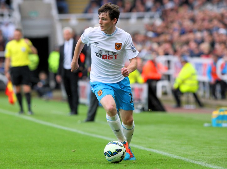
4. 2014/15 – The first third kit of the Umbro 2014 deal, utilised as the change kit for our gut-wrenchingly abortive first European foray. Simple stuff, but effective, marrying the long standing tradition of white change shirts with the post-centenary quasi-tradition of light blue in the change kit rotation, utilising one of the city’s civic colours. Not exceptional perhaps, but very good, this kit has settled into a mid-ranking kit in nine years of sartorial transit.
Aggregate fan ranking – 4th – Unanimity! Violent agreement!
3. 2017/18 – Ok, we’re getting down to business end of these rankings, and I can totally accept that for some people this is the best third kit of the recent Umbro era, and given the absolute awesomeness of the three that top my rankings, I might even rotate between the three on any given day considering kits. Which I do. Daily.
Navy Peony then, a lovely mixture of cyan and deep blue, chosen as one of the top 10 Pantone Fashion Report colours of 2017 and a tone that had beret wearing interior design influencers frapping themselves dry over the sheer versatility of it all… “use it in kitchens, bathrooms, nurseries, get yourself Navy Peony lamp shades, pillow cases, bread bins! It’s contemporary but cozy! It’s an anchoring shade!” Uh huh.
It also worked for football kits too, especially when you add amber trim. Beyond the colour itself, this kit had fun features such as a front body panel tigerprint Jacquard weave, crikey you don’t see those much any more, which is a great shame as they’re mighty classy, a lot of reissued classic kits or homages to them such as Umbro’s collab with post-punk synth-pop outfit New Order use dye-sublimation to give the effect of Jacquard weaving but it’s a pale imitation of the real thing. Furthermore, the heat bonded amber stripes featuring repeated Umbro diamonds on the shirt shoulders and shorts sides look great. Magnificent, not just one of the best City Umbro kits, but near the top of the entire Tigers kit pantheon full stop.
Aggregate fan ranking – 1st – The favourite of the masses
2. 2021/22 – I’ll reiterate that the top three kits here are so awesome as to be interchangeable, but on the page I’m putting the lovely Navy Peony behind 2021’s ‘Wine’, solely because I’m a sucker for a kit that pays homage to our rich kit history, and because the 2021/22 third is based on one of my favourite away kits ever – the claret /maroon /burgundy /carmine /cranberry /oxblood /whatever you want to call it 1995-95 change kit by Super League. My phone’s lockscreen features an image of my missus wearing the maroon shirt and beaming while meeting Rob Dewhurst back in the day, two of my biggest loves in one photograph, and I’m not talking about Big Bob. Hell, the 1995-97 away was so cool it was used in the Nickleodeon show Renford Rejects.
I was delighted when City threw back to that kit, and wounded when it only got one outing. Cleverly, City registered the third kit as having amber shorts, since the EFL had just effectively outlawed alternate shorts by declaring that only three shorts sets could be registered, and having amber shorts that could be used with the amber primary shirts offered useful interchangeability. It was always planned that the black primary shorts would be used with the Wine shirts and socks even if technically that constituted a Mash-Up. The only time amber shorts were used with the Wine shirts was by the developmental team. Mark Greaves was asked to model the new shirt with his son, Jacob Greaves, to show the era spanning nature of this colour shirt, but Daddy Greaves elected not to so the focus was on his son and not him. Touching stuff eh? But City made the connection anyway! Heh! I love this kit. Hard.
Aggregate fan ranking – 2nd – Unanimously the second best third kit.

1. 2019/20 – I totally understand why many would prefer the Navy Peony, and if you ask me another day I might say that too, such is the strength of the trio of kits that unanimously make the top three, even if I order them differently from the Tiger Nation’s aggregate view. Today however, I’m going with the 2019/20 third. Now, I have been known to mock some of the more tenuous explanations for kits upon launch, you know the kind of thing… “The colour represents the energy and speed of the current team”, but I was drawn in by the talk of “the iconic colours of Boothferry Park” when this kit was launched.
How do the Pantones ‘Deep Lagoon’ and ‘Medieval Blue’ represent our former home you may ask, well, I’ll explain. Before Don Robinson rescued the club in the early 1980s and ordered an amber, black and red repaint of the ground, Boothferry Park had a classic ‘stadium green’ paint job. Think Wimbledon, think Twickenham, think Wrigley Field, only the green of City’s home in the 60s and 70s had a bluish tint, as seen here when legendary boss Cliff Britton stands in front of the gym entrance, with the back of the South Stand in shot. Some of that teal-y green survived the repaint, remaining on the insides of a window hatch on a rickety old ticket shed that sat in front of the South Stand. That shed gained immortality when it featured in photographer Stuart Roy Clarke’s ‘Homes of Football’ collection, which was displayed at the National Football Museum. The navy blue tone is said to be from leather seats from the old West Stand, but we’ll take the words of others on that one.
That consideration of club history just elevates this kit over the Navy Peony for me, that’s a cool colour, but it doesn’t say much about Hull City. Again though, there is a fag paper between all three kits that top these rankings, that’s a testament to the fine job Umbro have done for us in recent years. While having a new supplier, one we’ve never been associated with is exciting, I am going to miss the double-diamond brand, who are a perfect match for our club in my opinion. Love you Umbro!
Aggregate fan ranking – 3rd – We like this kit more than most, but there’s not that much in it.
So there you have it, that’s a quasi-definitive ranking of Umbro’s third kits, 2014-2022. Thanks again to all who contributed. Keep an eye on our Twitter and Instagram accounts (@HullCityKits) for more City kit pornography and musings.
