

With primary kit order decided, it’s time to rank the nine change kits that Umbro have supplied the Tigers with between 2014-2023…
Black and white thinking may be a psychiatric concern in everyday life, but for City kits it demonstrates a respect for longstanding tradition (The Tigers had white as a change colour all the way back in 1904 and it was the default away kit look until the early Nineties when advances in dye-sublimation technology opened up new possibilities and the replica shirt boom motivated clubs to consider yearly kit changes, though even then white was a staple) and relatively recent tradition (black wasn’t an option until refs gave up exclusive rights of the tone, 1992 for the Premier League and early 2000s in the Football League) which began in 2003/04 and has since settled into a pattern of white one season, black the next.
It might not be hugely exciting, but mostly it gives us a functional alternative when the amber and black primaries can’t be used. Excitement is for third kits, when something as far away from the primary and change kits is needed, and we’ll get to those in due course.
NB. Though we understand that kits become ineluctably linked to the games and season(s) they are worn in, we’re judging the 2014-2023 kits purely on aesthetics and technologies. Relegation does not render beautiful polyester unpalatable, and promotion does not transform bang average kits into masterpieces. We canvassed the opinions of Tiger Nationals on Twitter ahead of writing this article, using a Google Doc to collate votes, and though we asked people to just consider the visual and sartorial appeal of kit and not be swayed by events that occurred when they were worn. Because this is our own corner of the internet, we’ll order kits by our own ranking first in descending order, but state how they fared in the aggregate view of Tiger Nationals who voted.

9. 2016/17 – In isolation, the 2016/17 change shirt is quite smart. It features an inner layer of amber that peeks through a black mesh outer layer, and up close it looks quite good. The problem is, at a distance the dots of amber merge with the black, and since the shorts and socks of this ostensibly all-black kit are solid black, the full kit looks tonally disjointed and a bit of a mess. Perhaps having shorts that used the same dual layer fabric would have looked better overall, though it didn’t seem to be a problem for Everton, whose away shirt had the same treatment. As with the home kit, the shade of amber used was on the orange side of what we’d consider correct. Also like the home kit, this change ensemble is a polyester metaphor for City’s shambolic 2016/17 campaign, which resulted in relegation.
Aggregate fan ranking – 9th – The voters are with us on this one.

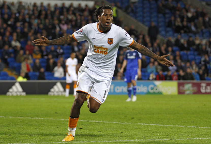
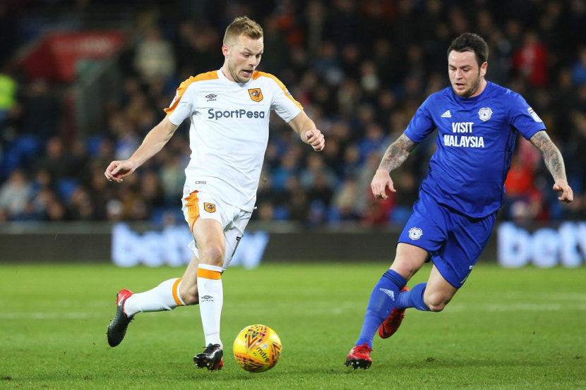
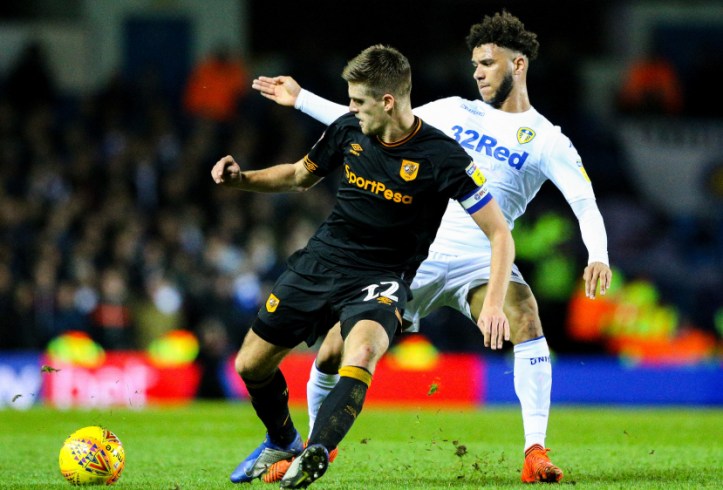
8. 2019/20 – Black and amber trim on an otherwise white shirt has been a recipe for some classic Tigers garments, such as the 1992/93, 1997/98 and 2007/08 away shirts. This one is part of a slightly disappointing kit, which can be put down to inconsistent use of trim. What a shame, as the shirt features a smart shattered diamonds Jacquard weave, but the amber trim that decorates the black cuffs of both the short sleeved shirts and socks is oddly absent on the cut-off V neckline, and that makes the kit look unfinished. It wasn’t used much, at Luton with the amber home socks and at Wigan for the 8-0 dry bumming, so there are precious few good memories associated with this kit. Still, we’re only judging it on aesthetics and it feels somewhat lacking. Functional, but dull.
Aggregate fan ranking – 6th – voters liked this kit a bit more than us
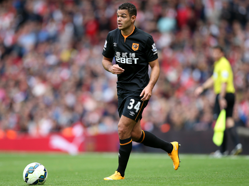
7. 2014/15 – The first away kit of the 2014 Umbro deal, and seemingly designed solely to justify having a third kit. Simple stuff, a plain black shirt but for a ribbed amber panel seen through a neck ‘notch’, with thin amber stripes the only decoration on black shorts and socks. Ho hum.
Aggregate fan ranking – 8th – Tiger Nationals rate this kit marginally less than us
6. 2015/16 – This kit makes much better use of amber than its 2019/20 counterpart, but again the use of trim is inconsistent. The two-piece crew neck is a black and amber split, but the rest of the kit’s trim is only amber, on the sleeve cuffs, short hems and sock turnover bands. Odd choice.
Aggregate fan ranking – 7th – Voters like this kit a wee bit less than us, but there’s very little in it.
5. 2017/18 – This is an all-white away kit done really well, with balanced use of trim. The thick amber stripes across the shoulders and partway down the shorts contain a lovely repeating double-diamonds trim woven in, a nod to classic Umbro kits of the late Seventies and Nineties. It’s understandable that black away shirts are preferred as a leisurewear choice, but as highly functional sportswear that scratches the traditional change kit itch, this is a fine Hull City kit.
Aggregate fan ranking – 5th – The masses agree with us, it seems

4. 2020/21 – Not quite an all-black kit, the 2020/21 change adds ‘carbon’ grey to the mix. Shirts with prints honouring stadia have been popular the last few years, Everton and Middlesbrough have produced fine examples, and following a third kit that referenced Boothferry Park through colour blocking, Umbro gave us a kit that referenced our current home in a more obvious way, through a roughly drawn abstract print of the West Stand steelwork on the grey front panel. The black shorts and socks with amber trim match beautifully with the black Raglan sleeves. When this kit was first released it was describes as the best kit ever by some online, but over time it has dropped down the pecking order since the release of newer change kits.
Aggregate fan ranking – 4th – We’re all on the same page

3. 2021/22 – Blackout kits have proven remarkably popular in recent years, with Dortmund and AIK Stockholm leading the way. Umbro gave us one at exactly the right time, before they could be dismissed as being too derivative, and the first batch selling out with coin eyed resellers on auction sites trying to profit on the shirt’s popularity acting as testament to that. A second season of use with a new sponsor doesn’t seem to have diminished the love for this kit, which we like very much but rank lower than two other kits only because blackout kits are about coolness, and not club identity per se, and we prefer kits that scream ‘Hull City Association Football Club’. Fabulous though, no arguments there.
Aggregate fan ranking – 1st – Voters like this kit significantly more than us, it’s the favourite of the masses

2. 2022/23 – There exists the possibility that we are all succumbing to ‘recency bias’ in declaring love for the last Umbro change kit for a while, and at HCK Towers we’re certainly suckers for a shirt that honours the club’s sartorial past. As much as the rebooting of the 1992/93 tiger stripe shirt was inevitable, so was a reference to the red used as a tertiary colour throughout much of the Eighties, when a change in ownership infused a club that had been on a downward slide and fans in conflict with ownership, with belief and positivity. Sounds familiar eh? The timing of the release of this kit, based on the 1984-86 change kit by Admiral, soon after a takeover by Turkish owners welcomed by fans holding up the red flag first adopted by the Ottomans, seems utterly serendipitous. It works on every level, as a throwback to memorable times, as an unplanned nod to new(ish) owners and as a functional away kit that uses a traditional away shirt while being useful away to clubs who usually wear white shorts. A modern classic.
Aggregate fan ranking – 2nd – If voters agree with us, that’s definitive, right?
1. 2018/19 – We totally get the love for the blackout kit, but for us a kit more in tune to our visual identity trumps it. The beauty of all-black as a change kit is that we get to wear our regular colours of amber and black, just inversely proportioned, as an alternative to amber and black. This kit, for us, does it best of all, as the simple crew neck with a thin amber band between two black bands makes the shirt look like a negative image of the 1965-69 home kit associated with the Third Division championship and the goal-packed play of ‘Waggy and Chillo’. Magnificent.
Aggregate fan ranking – 3rd – We like this kit more that most.
So there you have it, that’s Umbro’s 2014-2023 change kits ranked. We’ll do the final part, third kits, next. That’s bound to generate the most disparity in views we reckon. Keep an eye on our Twitter account (@HullCityKits) if you want to vote for your favourite and least-favourite thirds.
