

Double-diamonds are not forever, it seems. With City agreeing to wear Kappa from 2023/24, the excitement of being outfitted by a new supplier (and in particular the Italian sportswear marque beloved of 1980s B–boys, Vicky Pollard and 1990s Prinny Quay chavs, Soprano family enforcers, Damon Albarn, oh and some the finest footballers and coaches ever) is tempered somewhat by the loss of venerable brand Umbro. All good things, as the saying goes, must come to an end.
City have been with Umbro for nine seasons, extending the initial four-year deal (2014-2018) twice, with the last extension running for just one season, the current campaign. That period has taken in an all-too-brief foray into UEFA sanctioned competition, two promotions (one via a trip to Wembley, the other as division title winners), three relegations, five shirt sponsorship deals and an ownership change.
The club and Umbro go back much further of course, not only did they outfit the Tigers when they made their first trip to Wembley (2008) and played in their inaugural top-flight campaign (2008/09), City wore Umbro long before conspicuous manufacturer logos were a thing, at the latest 1955-61 (we know this because the club have a framed Umbro ‘continental’ template shirt at the stadium) but maybe earlier than that, the double-diamond brand started supplying professional sides in the 1930s. Hull City and Umbro feel like a perfect fit, and we don’t even feel we’re being subjective when we state that the nine year spell has represented a golden age for Hull City playing kit.
That’s not to say that every kit produced between 2014-2023 has been wonderful, but there has been far more good than bad, with some excellent in the mix. To mark the end of the nine-year deal, we’re going to rank each Umbro kit according to its own type, primary kits first, then change kits, concluding with a look at the Pantone chart bothering thirds.
NB. Though we fully understand that kits become ineluctably linked to the games and season(s) they are worn in, we’re judging the 2014-2023 kits purely on aesthetics and technologies. Relegation does not render beautiful polyester unpalatable, and promotion does not transform bang average kits into masterpieces. We canvassed the opinions of Tiger Nationals on Twitter ahead of writing this article, using a Google Doc to collate votes, and though we asked people to just consider the visual and sartorial appeal of kit and not be swayed by events that occurred when they were worn, humans gonna human. To that end, we’ll order kits by our own ranking first (dealers choice!) in descending order, but state how they fared in the aggregate view.

9. 2016/17 – This kit is a polyester metaphor for the disorganised summer of 2016, when City lost their manager soon after winning at Wembley and prepared for a Premier League return with nary a full first XI. The situation was aptly captured by a nine-man ‘squad photo’ in front of the Brandenberg Alps in Austria. A kit that referenced the late 1970s Europa shirts with white collars and cuffs and bold, thick stripes was a neat idea, but the execution was somewhat lacking.
A lot of this down to the wishbone/stethoscope shaped ‘Kiwi’ collar, which gave the shirts an unflatteringly loose fit across the shoulders, but the blue ‘globe’ device underneath sponsor SportPesa’s wordmark looked a bit naff too. Curiously, the shorts designed for the away shirt were also used with the home shirts, despite not visually connecting in any way.
The amber bands on the back hems of the shorts visually connected to the split cuff panels on the change shirts that were 50/50 black rib and amber mesh, but since the primary shirts had solid white cuffs, these black shorts looked obviously part of another kitset. What’s more the amber of the socks was quite a bit brighter than the orangey shirt amber, so the full kit looked mismatched, although the socks did at least connect visually to the shirts because of the white bands.
Aggregate fan ranking – 7th – The masses like this kit more than us
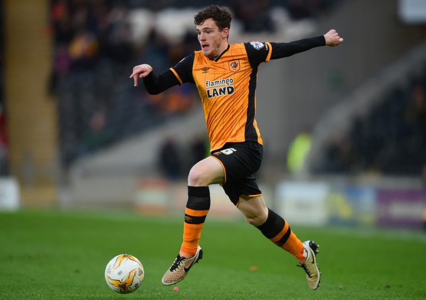
8. 2015/16 – Some people mocked the Flamingo Land sponsor, but rather the North Yorks. theme park than Cash Converters as sponsor if you ask us. In truth, this isn’t a bad kit at all, it just wasn’t very inspired. Umbro gave us another black pinstriped shirt six years after the first one, from 2009/10, but with added black on the sleeves and on underarm stripes.
The neckline was good on this shirt, a black wrap-over V with amber tipping trim, reminiscent of the mid 1980s when pinstripes were everywhere. Being used in a Wembley victory has given this shirt more time in the collective consciousness than it really warrants, but replays of Mo Diame’s wonderstrike to defeat Sheffield Wednesday to promotion will do that.
Aggregate fan ranking – 8th – voters agreed with our view

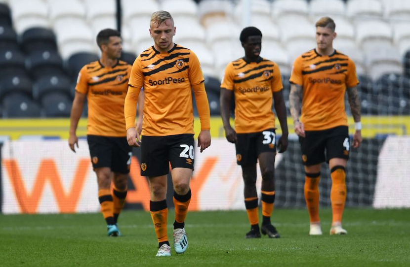
7. 2021/22 – This is a fine Hull City garment, and if it was a training shirt we’d proclaim it the best training shirt of all, but as the main part of a primary kit it lacked the gravitas a shirt with traditional vertical stripes will give you.
Although the most notable visual element is the diagonal ‘glitch sash’ pattern, what many City fans liked the most was having the club’s name on the shirt, courtesy of a redesigned crest. The sponsor wordmark was applied very tastefully, with a black keyline so it doesn’t get lost in the noise of the shattered sash pattern. Again, this is a fine garment, but there are better in the polyester pantheon.
Aggregate fan ranking – 9th – Tiger Nationals dislike this kit more than us
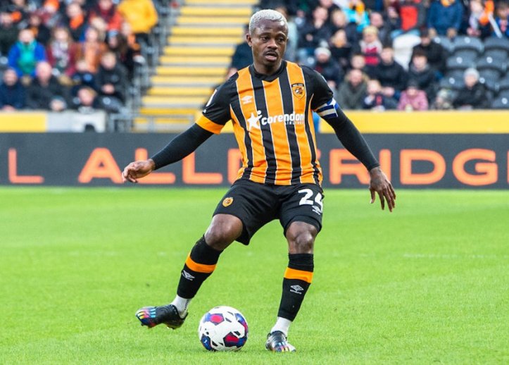
6. 2022/23 – This is a solid entry with some fascinating features. The white pinstripes that separate the irregular width amber and black stripes evokes the ‘Great Escape’ shirts of 1998/99, and also give the garment a vaguely Brazilian feel, as several big clubs in the Campeonato Brasileiro Série A have multi-striped shirts with white separating two other stripe tones (such as Grêmio, in blue, black and white, and Fluminense in green, maroon and white.)
The shirt also features a tonal tiger stripe print throughout, though it can make the amber stripes a bit orangey. Still, a very solid design indeed.
Aggregate fan ranking – 3rd – Voters like this kit significantly more than us

5. 2014/15 – The first home kit of the 2014 deal had very classic trappings. The thin stripes and solid amber sleeves of the 1990-92 shirt were put on an almost 1960s looking body, with a simple rib crew neck and set in sleeves, only the sponsor with Kanji text shattered the Sixties look.
Essential plain black shorts and plain amber socks completed the retro look, which is quite beautiful, though we acknowledge that’s not everyone’s bag. The only fly in the ointment for us was this being the first kit to feature a reworked crest that seemed like a petty jab at those who defended the club’s name when the owners tried to change it as part of a petty spat with the Council, since it omitted the club’s name.
Aggregate fan ranking – 5th – The masses agree with us, it seems
4. 2019/20 – Modernising historical home kits was a recurring theme of the nine year deal with Umbro, so revisiting the literal tiger stripes of the early to mid-1990s was frankly inevitable. Nonetheless Umbro did a great job, limiting the stripes to the upper chest which removed the problem with natural camouflage patterns… they blur at distance and fade into the surroundings.
We’re not keen on the idea of replicating this look a lot, but as a once a generation throwback? Yep, that’s all good, and this kit is superbly executed. What a shame we got relegated in it, it deserves a much better season association.
Aggregate fan ranking – 2nd – Voters are more fond than us of tiger stripe reboots

3. 2019/20 – Umbro’s knack for rebooting classic Hull City home kits is well evidenced here, as the black chalk-stripes on an amber field recalls the shirts worn in the second half of the 1964/64 season, when we inexplicably changed tops halfway through the campaign.
A subtle but magnificent element was the tonal ‘Diamond Stripe’ printed on the shoulders of the shirt and on the sides of the shorts, reminiscent of the sewn-on taping used by Umbro sides in the late 1970s. Lovely stuff.
Aggregate fan ranking – 6th – Voters possibly think we’re crazed for liking this kit so much

2. 2018/19 – The Umbro ‘Diamond Stripe’ became more conspicuous in 2018/19, being rendered in contrast tones on the sleeve cuffs rather than appearing as a subtle tonal print.
Umbro also delved into their archives for the shirt body, with ‘twinstripes’ on the body, or amber pinstripes splitting black stripes, recalling a look that Umbro gave an Aberdeen away shirt in the 1990s, although the order of amber and black was inverted for the Dons. A retro look, that also looked contemporary. Superb!
Aggregate fan ranking – 4th – We appreciate this kit more than voters, evidently

1. 2020/21 – We didn’t get to see this one in the flesh much, given that the 2020/21 season was played behind closed doors, but my word it’s utterly perfect. We know that people are craving wild dye-sublimation prints evoking the kits of the 1990s at the moment, but this is frankly the perfect Hull City kit.
It’s classy, but also busy on account of the high contrast stripes, but not so busy to be gaudy. Having the sleeves in solid amber really brightens up striped shirts, while retaining our signature look, a look that we as a football club own. This is our visual identity and it is magnificent, check out that simple but sweet V neck! Only hooped socks could make this kit any better.
Aggregate fan ranking – 1st – We’re all on the same page, the love for this kit is strong
So there you have it, that’s Umbro’s 2014-2023 home kits ranked, maybe definitively. We’ll do change kits next, keep an eye on our Twitter account (@HullCityKits) if you want to add your two-penneth!
