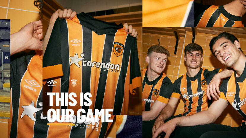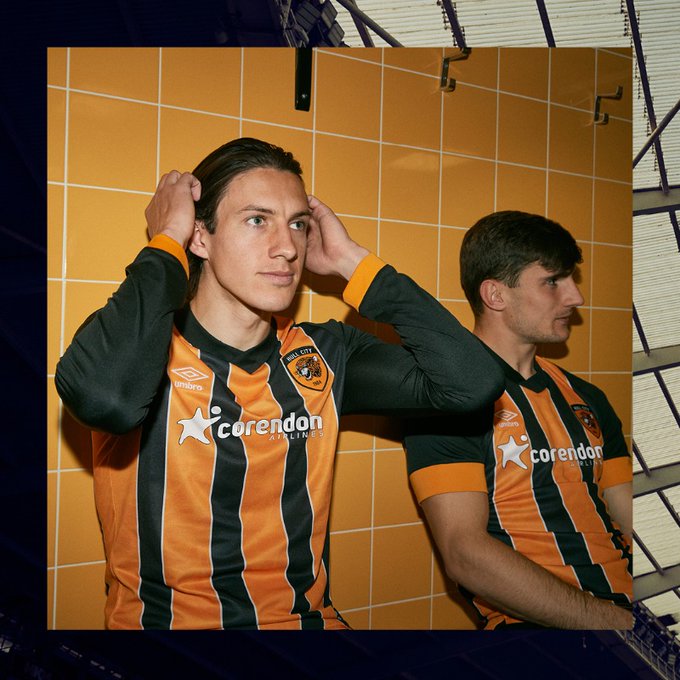
The first summer transfer window of the Acun Ilıcalı era is ajar, and we now know what City will wear at home for the first full season of the Turkish entrepreneur’s ownership, even if it will have been approved by the previous regime. @SombreEthyl considers the 2022/23 primary kit shirt by Umbro.
Sunday might be the day rest to some, but at Hull City, with a new era to unpack, there was work to be done on the Sabbath in the form of a kit launch on July 3rd.
Or rather, a shirt launch. They still call them kit launches, but seeing players dressed head to toe in a full new kit seem to be a thing of the distant past (2018), now we get to see just the shirt worn by a few players in a dimly lit dressing room and then the ‘streetwear’ shots of a brooding young man sat on a concrete stairwell wearing the shirt over a hoody. Careful fella, you’ll get piles.
We get a vague description of the shorts and socks from the 2022/23 home kit on the club’s website “shorts are black with wide side panels and a contrast coloured middle panel…black socks include an amber calf hoop”, but without seeing them we’ll offer no opinion on them, it’s hard to fully judge a full kit until you’ve seen a full kit.
The 2022/23 primary shirt then…”the shirt sees a return to our traditional black and amber stripes, with a white pinstripe border and tiger pattern. The jersey also features micro eyelet front and back panels, interlock sleeves, stylised rib v neckline with rib cuffs, dropped back hem, ‘Tigers’ back neck sign-off, appliqué crest and stacked diamond embroidery.”
Very pleased to have stripes back after our season long dalliance with a solid amber shirt with ‘glitch sash’, which would have made for the best Hull City pre-match warm-up top ever but didn’t quite say ‘Hull City’ as much as a primary shirt should.
No such issue here, with bold amber stripes and thinner black stripes this shirt doesn’t just say “Hull City”, it screams it. We own amber and black stripes, it’s our club’s cultural copyright in the same way a red bodied shirt with white sleeves is Arsenal, and blue and black stripes is Inter. It doesn’t matter if someone else uses the look occasionally, and in our case Barnet and Cambridge occasionally try stripes on for size, but when a look is unmistakably owned by one club, they’d be wise to stick with it.
Intriguingly the amber and black stripes are kept apart by white pinstripes, which brings to mind some of the recent Umbro shirts made for Brazilian clubs such as Fluminense and Gremio who use white to split distinctive stripe colours.
Most of the Eighties aside, when we used red as a tertiary colour, white has been the de facto trim colour for Hull City. Sometimes we’ve given it more prominence than just a trim tone, such as throughout the Twenties, the 1920s that is, for the second half of the Seventies, and for 1998/99.
Of course! The ‘Great Escape’ season! There are definite visual clues to the one and only primary shirt made by Olympic.

Umbro are, to their credit, too savvy to straight up reproduce a past shirt design, but they’ve subtly referenced historical home shirts a few times: The 2009/10 shirt featured pinstripes akin to the 1982-86 designs (adjusting for the move away from red trim), the 2014/15 with thin equal width stripes and solid amber sleeves loosely resembled the 1990-92 Matchwinner, 2016/17 with it’s white kiwi collar and wide stripes borrowed the 1975-80 Europa aesthetic, and of course 2019/20 riffed on the infamous tiger stripe shirt of 1992/93.
This shirt shares some of the characteristics of the 1998/99 Olympic jersey without being too on the nose: As memorable as the ‘Great Escape’ design was, white was given as much prominence as amber, which had to be darkened to avoid looking washed out next to that much white, as the two tones gradated together.
Here, white pinstripes simply bookend the amber and black stripes, using white correctly as a tertiary club colour. The black V-neck had a turnover collar in 1998, here just a fat black wrap-over V contrasts the shirt body, and visually connects with the mostly solid black sleeves, which were also a ‘Great Escape’ shirt feature.
On short sleeve shirts the arm ends with a fat contrast cuff in amber, which again evokes a Brazilian shirt feel, or at least a Gremio shirt feel as wide contrast cuffs regularly feature on those. On long sleeved shirts (and boy does it feel good to be typing those words after the long sleeve option was removed last season) the amber cuff is not quite so wide.
City have a new main sponsor for 2022/23, Turkish airline Corendon, the carrier responsible for the Hull City liveried Boeing 737-800 that since May has been spotted in Cologne, Gran Canaria and Sardinia. To their credit, Corendon are evidently fine with their logo being rendered sympathetically in white on our new home shirt, instead of in the airline’s corporate colour of red.
Of the features described in the club’s launch blurb, the ‘tiger pattern’ is the one that is hardest to make out on launch imagery, real squint or you’ll miss it stuff. Without seeing the shirt in the flesh, well, polyester, it’s hard to tell if this is done with a Jaquard weave, or if it’s lightly embossed/debossed, because little effort seems to have been made to show this in the launch photography.
On first viewing, beyond liking the return of stripes and subtle use of white trim, I was a bit underwhelmed by the new shirt. I put this down to the photography, which seemed rushed and a bit, well I hate to say this, but… amateurish.
The images of Jacob Greaves, Keane Lewis-Potter and Ryan Longman sat apparently in the dark at the MKM Stadium, with flash photography creating dark shadows and making the amber of the cuffs look very different to the amber of the body stripes, do not do this shirt justice. The shot of someone holding the shirt up in front of their face does not, to my eye anyway, look like the work of a professional photographer, and it looks like something done in a hurry by the club, possibly a result of the sponsorship change.
However, a look at other shirt releases on the Umbro Twitter feed shows this to be a conscious aesthetic choice by the supplier. The Huddersfield home, Hearts away and Werder Bremen primary shirts are all captured the same way, low light settings, deep shadow from flash use and one image of the shirt being held up. Not a fan, and after some consideration I think the new home shirt is going to look far better in person than it does in launch photography, and that feels a bit weird.
Given that our owner owns Kappa Turkiye, it’s possible that this is our last Umbro shirt for some time, so let’s consider the good and the bad of the 2022/23 primary shirt by Umbro…

✅ Back in stripes, our signature look.
✅ References a classic shirt, but retains enough distinctiveness to be judged on it’s own merits.
✅ Sympathetic sponsor treatment.
✅ Long-sleeves are back!

❌ Lack of trim on the wrap-over V-neck. I just feel that a pinstripe of white tipping trim on the neck, matching white piping separating the black sleeve from the amber cuff would elevate this shirt a bit.
❌ Misaligned stripes where the back panel meets the front panel on the shoulders look a bit naff.
❌ Though this shirt is being described as ushering in a ‘new era’, the long lead times of kit design and production mean this shirt was approved by the previous ownership, which explains the ‘TIGERS’ sign off on the neck, which of course violates the laughable, thrown together in ten minutes ‘branding guidelines’ that the club once put out which insisted the club should be styled as ‘THE TIGERS’. No big deal, just the last reminder of how petty and inept Ehab Allam is, and how his family’s attempt to vandalise club identity ended in wholly predictable failure.
